Open Concept vs. Defined Living Spaces
Buyers Elise Wishlow July 9, 2024

Buyers Elise Wishlow July 9, 2024
In The Not So Big House: A Blueprint for the Way We Really Live, architect and author Sarah Susanka offers a revolutionary approach to home design that emphasizes quality over quantity. Susanka's philosophy challenges the conventional wisdom of building ever-larger homes, advocating instead for spaces that are more thoughtfully designed to suit the way we truly live. Here, we explore some of the key concepts from her book: space, light, and order.
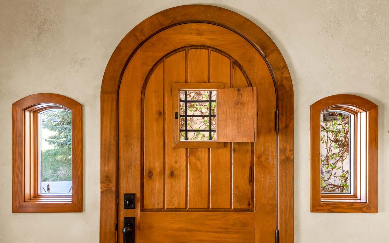
Susanka highlights the importance of a well-designed entrance. It’s not just a functional space but also the first impression of the home. A welcoming entrance sets the tone, creating a sense of arrival and transition from the outside world into the personal sanctuary of the home.
One of Susanka's core principles is creating personal spaces for each family member. Whether it’s a cozy reading nook, a small office, or a craft corner, having a place to retreat to fosters a sense of ownership and personal comfort within the home.
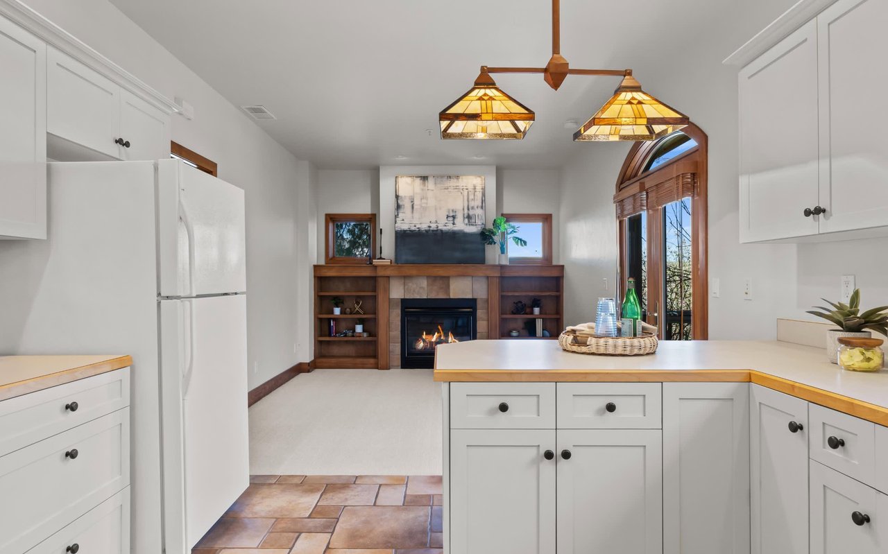
Changes in floor levels are another technique Susanka uses to define different areas within an open floor plan. Even a single step up or down can create a sense of separation and intimacy, distinguishing living areas from dining spaces or kitchens.
Similarly, varying ceiling heights can delineate different zones in a house. Higher ceilings can make public areas like living rooms feel more open and grand, while lower ceilings in private spaces such as bedrooms and studies can create a cozier, more intimate atmosphere.
Susanka stresses the importance of both views and non-views. Windows should frame specific, beautiful outdoor scenes, turning nature into living art. However, it’s equally important to have walls or spaces that don’t compete for attention, allowing the eyes to rest and the architecture to shine. Strategic placement of windows ensures that every room benefits from natural light without overwhelming the senses.
In Susanka's designs, elements like grilles and lattices serve both functional and aesthetic purposes. These features can provide partial separation between spaces, maintaining a sense of openness while adding a layer of visual interest and texture. They also help in directing movement and views within the house, subtly guiding the flow of traffic and sightlines.
Many new luxury homes on the Boise and Eagle, Idaho, markets today feature great rooms, which combine the living room, dining room, and kitchen into one expansive space. Open concept floor plans can be great for young families. Gioi Tran, co-founder and principal designer of San Francisco-based firm Applegate Tran, says that open floor plans still offer space for families to connect.
"The idea of everyone in a household coming together to prepare meals, watch television, and engage with one another in the living room promotes the feeling of connectivity and closeness that I don't think people would choose to go without."
-Gioi Tran
Open concept layouts can also work for people who love to multitask. Parents can work at the table while keeping an eye on the kids in the next room. Entertainers can cook while visiting with guests.
While these open-concept designs remain popular, they come with several drawbacks that Susanka's approach seeks to address:
Great rooms can often feel impersonal and cavernous. Without distinct areas for different activities, the sense of coziness and intimacy is lost. Susanka's use of changes in level and ceiling heights creates more intimate spaces within the home, making each area feel distinct and comfortable.
In a great room, noise from one activity can easily carry over to other areas. Cooking noises from the kitchen can disrupt conversations in the living room or concentration in a home office area. Susanka’s designs incorporate subtle separations and personal spaces to mitigate noise and allow for quieter, more focused environments.
The uniformity of a great room can lead to a lack of visual interest. By enclosing spaces and incorporating features like grilles, lattices, and strategic changes in space and light, Susanka’s designs introduce variety and complexity, making the home more engaging and visually appealing.
It’s possible that after spending years confined to our homes during the COVID-19 pandemic, people are wanting a return to defined spaces.
"I think we are all craving more of that variety and definition in our spaces, especially after spending so much time in our homes since the pandemic began."
-Lilse McKenna, Designer
Heating and cooling a large, open space can be less efficient than managing smaller, defined areas. Susanka's approach often results in more energy-efficient homes, as the design takes into consideration the practical aspects of maintaining different zones with appropriate climate control.
Ultimately, there are pros and cons to open concept designs, and it comes down to personal preference.
Sarah Susanka’s The Not So Big House invites us to rethink our living spaces by focusing on thoughtful design rather than sheer size. By carefully considering how we use space, light, and order, we can create homes that are not only more functional but also more beautiful and harmonious. This approach ensures that every corner of the house serves a purpose, providing comfort and delight to its inhabitants.
Stay up to date on the latest real estate trends.

Buyers/Sellers
Updates for the North End, North End Extended, and North End Non-Historic Areas

Buyers
For Buyers and Sellers in Idaho

Sellers
You Want an Agent with These Skills
Buyers
Invest Wisely and Age in Place

Buyers
East Boise's Not So Big House
Buyers
Come in Strong and Clean
Sellers
Preparing Your Home for Sale

Life
Where to Find Breakfast Food in Boise

Buyers
A Quick, Easy Home Valuation Process
Whether you’re ready to buy or sell now or want to know more about the local market, Elise would love to chat over the phone or a coffee! Contact her today!